Login to your account


Browse Our Archives
March 2014
Leaving Breadcrumbs
- Push to The Latest: No
- Show in The Latest?: No
Imagine arriving at a third-world airport and trying to find your luggage, a taxi and hotel without one single sign in English. Guests arriving at a new mountain resort can feel similarly overwhelmed or lost if there isn’t sufficient signage to show them where to go and what to expect. Whether your visitors are on the hill or in the parking lot, a good signage program will take the guesswork out of the equation and let customers relax and enjoy the day.
KEY CONSIDERATIONS
Whether hiring a sign specialist or doing it in-house, there are a few considerations that the experts all agree on: get input from your mountain ops staff and patrollers. Look at what exists and how best to integrate some of it into a new program; then replace signs that have been damaged or faded.
In addition to conducting an on-mountain evaluation and discussing design matters, Leah Muirfield of Canada-based Inter-Mtn advises mountain managers that “the best thing they can do is ski with people who have never been there” and get their input.
Muirfield has visited a ski area with several parking lots, one of which accessed the bottom of a lift, but had no other services—including no ticket sales. She paints a scenario of a family on its first visit getting all geared up, then walking across the lot to the lift where the liftie must make the call as to whether to let them on the chair or send them back to their vehicle to start over at another parking lot. Not a favorable first impression. A “No Ticket Sales Here. Proceed to Lot Such-and Such” sign would be appropriate.
From a marketing perspective, signage that is integrated into an area’s branding program presents a coherent image. From the welcome sign at the approach to something along the lines of a “Thank You for Skiing With Us. Come Again” farewell, signs can solidify a resort’s message of welcome and imprint the brand on and off the slopes.
Wood & Wood has been making ski area signs for more than 40 years, since a Sugarbush patroller and artist named Sparky Potter began making signs on the side. After four years, he gave up the red jacket and established a resort sign business. In addition to an artful aesthetic, he is very keen on branding and a signage program’s role in it. Therefore, he works “in earnest” with each client’s marketing department to create memorable signage. “Wayfinding hasn’t changed much in 40 years,” he says, but much else has, including liability issues and many guests’ resourcefulness.
Potter also believes in “memorable” signs. To him, the aesthetic aspect of signs provides a sense of place that can continue from the mountain to a base area, hotels or other lodging properties. When visiting clients, he skis the runs and makes rough sketches on-site to provide a feel for the design, then watercolors them into working drawings and superimposes them on images of the environment.
Designing a sign program is a process. In rare situations like Revelstoke, B.C., which “went from zero to full open” when it debuted not long ago, the process is almost easy. As Muirfield points out, “they started with a blank slate.”
More often, new signage needs to dovetail with existing signs, and changes are more evolutionary. That was the case both at Québec’s Mont St.-Sauveur, where the look was overhauled but the name remained, and at Utah’s Canyons, which changed its name from The Canyons and redid its sign program, colors and all, in the process. In a three-step evolutionary process, the initial redesign incorporated symbols used to differentiate sectors of a very complicated mountain layout. Then signs were more heavily branded, using distinctive orange and white, and finally, the design was tweaked to make signs easier to read.
When Stowe, Vt., redeveloped Spruce Peak, Wood & Wood created exterior and interior signs that tied together terrain, real estate, hotel and even golf under one image umbrella. Stowe, like others, has added summer activities that require consideration of how to balance seasonal information, especially at the base area, into the sign program.
Of course, not every area needs a full-service sign company. Loon Mountain, N.H., for example, has its own sign shop and doesn’t need outside fabrication. But it turned to Wood & Wood to create a “sign book” for design purposes.
ON THE HILL
Out on the slopes, guests want just a few things from signs—help in navigating the mountain without getting lost, or ending up on runs that are wrong for them. New skiers and riders can have off-putting experiences on terrain that is scary, while experienced skiers and riders can be bored if they veer into a web of green-circle routes. This problem can be overlooked by managers, especially on complex mountain layouts at sizable ski areas where the clientele is primarily local season passholders. Management there can be too casual about signage, under the assumption that everyone knows his or her way around.
The most obvious goal of effective trail signage is to assist guests in finding their way around without having to pull out a map at every trail junction. In addition to indicating trail names and how each is rated, signs help people find day lodges, base village(s), on-mountain dining, terrain parks, pipes, recreational race courses, kids’ fun zones and, for larger more complex ski areas, entire mountain sectors. Signage needs to be considered when, say, a green cat-track ends at a steep run. “Easiest Way Down” and “Return to Base” are often useful.
Mountain signage also needs to be readable as people slide past, and contain a consistent logo and a color to create a seamless image.
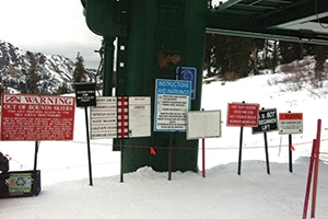
Beyond that, signs that clearly communicate safety information have become increasingly important, as risk management has become a key part of area operations. Signs and, where appropriate, banners convey such specific cautions as slow skiing zones, merging trails, hidden hazards like stump fields or rocky parts of trails, area boundaries, snowmobile use and avalanche zones. Sometimes, “signs are for lawyers,” says Muirfield.
Consistency is her mantra. Is the font identical on all signs? Are the letters big enough to read? Is the right information on all signs? Are they placed where they need to be? In addition to design consistency, is the message consistent? She says that she has seen “Closed,” “Do Not Enter” and “Avalanche Danger” along the same rope line at some Western mountains. She emphasizes that such messages should not conflict.
Boundary signs, for instance, must make it clear whether it is an open boundary with no patrol or avalanche control, or a really hazardous area of such slide risk, cliffs or other life- and limb-threatening areas that people must stay out. On the other end of the skill spectrum, signs indicating “Easiest Way Down” and “Return to Base” are not just guest-friendly, but also part of the risk management program. “Slow Zone” banners should be bold, with larger letters than informational signs.
And no matter the skill level, all sliders can have difficulties finding their way during or after a snowstorm. Slopeside residents, especially in the Northeast and Mid-Atlantic states where everything looks different after a snowstorm, often see tracks through their yards made by skiers who skied off trails.
Lastly, no matter how well maintained, shoveled and sanded, potential problem areas for falls on walkways and even parking lots should be signed. Slip-and-fall pictograms are useful, as are requests that guests report problem areas.
BUILT TO LAST
Out on the mountain, durability is an important factor for sign construction. The typical plastic sign has a lifespan of two seasons due to weathering. Other materials, such as polycarbonate, can last 10 times longer. “We encourage areas, even smaller ones, to find a product that will hold up outdoors,” says Jeff Stone of Stonehouse Designs. “If you have limited budget, I would try to justify spending a little more for something that’s durable. It will be in service longer, and your area will look nicer for a longer period of time.”
As an example of longevity, at the NSAA winter conference at Steamboat, Stone showed an attendee a photo of a 10-year-old polycarbonate sign Stonehouse had installed at Loveland. “The manager was from Loveland and said, ‘I know that sign, it’s still there, and it still looks good,’” says Stone. The photo was taken in 2004, so the sign is now 20 years old.
THE FUTURE OF SIGNAGE
What’s next in the realm of mountain signs? Sitour, a 45-year-old Austrian company that began with banks of phones at railroad stations so that travelers could directly call hotels for free, is on the cutting edge of technology and now produces mountain signage integrated with mobile apps in some thousand resorts. In the U.S., says recently appointed president Dave Cutler, it is finding new ways to integrate print, LED and LCD signage and NFC (near field communications) to enhance traditional print and digital signs. It is developing NFC capability to link the mobile devices that more and more skiers and riders are bringing to the mountains with traditional signs—a 21st century technical add-on to trail signage. More to come on this in future issues of SAM.