


Since 2021, we’ve asked resort marketers across snow country to give kudos to the work of their counterparts at other operations. Peers aren’t typically a marketing team’s target audience, but hopefully that makes this unexpected back pat all the more meaningful.
These “Peer Reviews” highlight marketing and communications efforts from the 2025-26 season that made an impact on fellow marketers for reasons they explain here.
This year’s peer reviewers leaned toward comms and campaigns that spoke to a mountain’s character and community and that valued transparency, authenticity, and self-awareness.
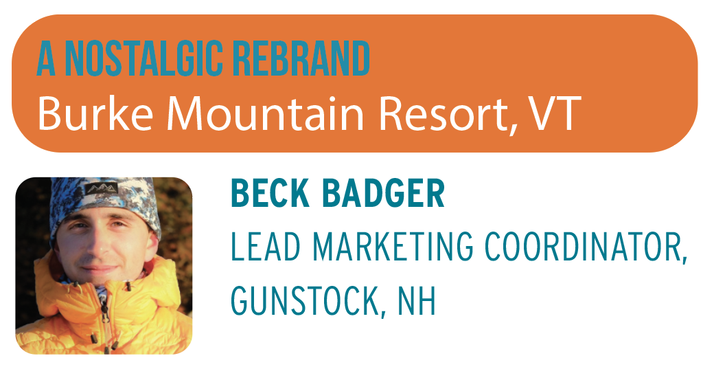
![]() To me, Burke has always stood apart among Vermont ski areas—not just because of its stunning location tucked away from other Vermont playgrounds, but also due to its classic New England charm, rich history, and the unwavering loyalty of its community. And the mountain itself has it all, from fantastic beginner terrain on the lower mountain to substantial glades and steep, challenging runs. I mean, there’s something to be said about this little neck of the woods, which, as the stomping grounds of Burke Mountain Academy, has produced some of the best ski athletes in the world.
To me, Burke has always stood apart among Vermont ski areas—not just because of its stunning location tucked away from other Vermont playgrounds, but also due to its classic New England charm, rich history, and the unwavering loyalty of its community. And the mountain itself has it all, from fantastic beginner terrain on the lower mountain to substantial glades and steep, challenging runs. I mean, there’s something to be said about this little neck of the woods, which, as the stomping grounds of Burke Mountain Academy, has produced some of the best ski athletes in the world.
As a member of the marketing team at another smaller, independent eastern resort, it’s always exciting to see a rebrand. Burke’s new logo pays homage to its roots, dating back to its founding in 1956. Featuring Burkie the Bear, the emblem is instantly recognizable and includes elements from the previous design, with its signature blues and reds and mountain silhouette. What I particularly love about this new logo is that its bubbly character doesn’t come off as kitschy but rather feels friendly and inviting, almost in a “Goldilocks and the Three Bears” way.
That fable suggests that finding the way forward lies in finding the middle path between two opposites, an idea the design of the new
Burke logo echoes. I believe that Burke is finding its middle path—the perfect blend of tradition and looking forward—as it steps into this new chapter under new ownership. The new logo delicately signals this change. I hope it’s here to stay.
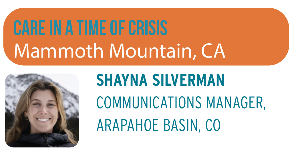
Mammoth’s social media and PR response to a terrible tragedy involving the death of a patroller in December was a work of resort marketing and communications that should be recognized. As a crisis communicator, I was blown away by the thoughtfulness and care, and how well the mountain navigated its community through such a difficult time. 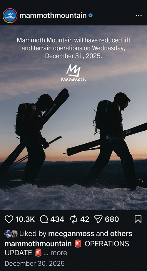 The most important role of a marketing and communications team in a time of crisis is to be the single source of truth so that your community and staff feel supported while respecting the situation at hand. That is exactly what Mammoth did.
Overall, the messaging on social media was balanced, offering operational updates without unnecessary details, providing transparency while protecting staff who were also dealing with this tragedy, acknowledging the gravity of the situation without sensationalizing it, and respecting all parties involved. This created clarity during a very real, very difficult couple of weeks and demonstrated a genuine care and concern for both the Mammoth team and community.
In the immediate aftermath of the incident, Mammoth released clear and concise updates on social media, sharing only verified information while avoiding speculation. It had a disciplined, fact based approach that kept the messaging steady and measured even as the situation shifted rapidly amid extreme storm conditions during a holiday period.
From a tactical standpoint, there were two key elements of the updates: leveraging Instagram Stories for quick info hits, and using in-feed posts for larger operational updates to prep visitors and staff for the day(s) ahead.
Lastly, the gradual and thoughtful transition back to normal content was just as notable as the initial response. After a mostly quiet period of grounding updates on Mammoth’s social channels, the marketing team slowly reintroduced scenic visuals and mountain highlights back onto the resort’s pages, reestablishing its uplifting and fun voice without diminishing the seriousness of what had just occurred. The shift felt organic, not jarring, and certainly not disrespectful.
This was crisis communication at its best: factual and steady, emotionally intelligent, and ultimately guiding an entire audience from shock back to stability with grace.
Although it might seem a bit cliché, I have to give a nod to Wisp Resort’s sister resorts for the incredible work they’re doing to keep the ski industry affordable, all while staying true to their unique brand voices.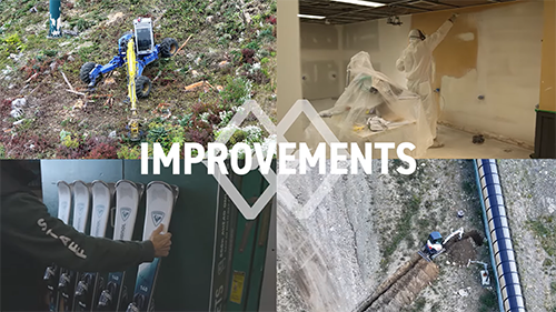 If I had to spotlight only one marketing effort from the PGR portfolio, though, I’d have to tip my hat to Mount Washington Alpine Resort, B.C., for its refreshingly honest “Mountain Update Series,” featuring general manager Mike Manara. The video “A Season of Upgrades Indoor & Outside: Hear from Mike About What’s New for Winter 2025-26,” which recaps $3 million in capital improvements, from brush cutting to new bar tops, particularly stuck with me.
As marketers in the business of selling snow, we know it’s no easy feat to make pushing dirt around look exciting, especially when the full vision doesn’t come to life until the first flakes fall. Mount Washington combines authentic storytelling, dynamic videography, and Mike’s natural charm to deliver a concise, engaging update that seamlessly communicates the real value behind all that groundwork.
The series goes further than spreading pre-season stoke, though, providing consistent mountain updates throughout the winter that openly addressed the realities of the 2025–26 season, from weather challenges to marginal terrain conditions. To me, there’s no stronger way to build brand trust than through regular, transparent communication, and Mount Washington executes this beautifully.
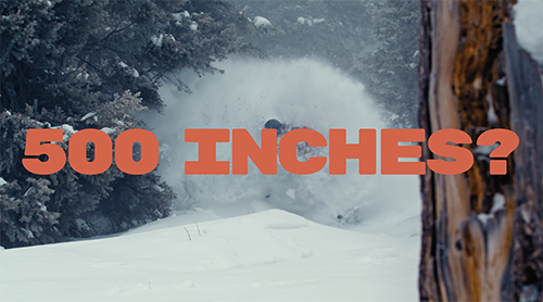
Ski areas spend a lot of time trying to convince people their mountain is special. Grand Targhee decided to try the opposite approach. In “Grand Targhee: Not that Grand,” the Wyoming resort takes the things most ski areas brag about—deep powder, wide-open terrain, and great views—and spins them like they’re reasons you might want to stay away.
 By underselling everything happening on screen, the ad projects a quiet confidence that feels far more authentic than a traditional promotional pitch. It’s a subtle approach, but one that immediately makes the piece feel different from the usual resort marketing playbook.
That confidence is also what makes the campaign smart marketing. By poking fun at the idea of a traditional resort advertisement, Grand Targhee manages to stand out without feeling like it’s trying too hard. It also fits the resort’s personality perfectly. Targhee has long had a reputation as a laid-back powder haven—less glitz, more snow—and the humor reinforces that identity rather than trying to turn it into something it’s not.
What I like most about the ad is that it trusts the product. The message isn’t “we’re the biggest or most luxurious resort.” Instead, the ad almost shrugs and lets the skiing speak for itself. And when the skiing looks that good, that confidence works.
In an industry where marketing can sometimes feel overly polished or self-serious, this approach is refreshingly simple: show great skiing, make a joke about the whole marketing exercise, and let the audience figure out the rest. It’s the kind of ad that makes you smile because it feels honest. Grand Targhee didn’t just make another ski ad—it made one that playfully pretends it isn’t an ad at all.